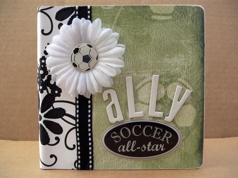
 Ok after a slight pause we are back with the weekly scrapping tips. Last week's weekly tips post was postponed to this week because I didn't want to show it here before my client had a chance to show it to her recipient. I am excited how this album came out - I didn't have a lot of time to put it together, and I wasn't sure where I was going with it at first, but the key to pulling this one out successfully was to KEEP IT SIMPLE.
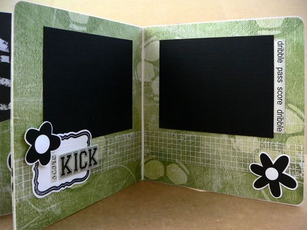
This album was for a little girl who adores playing soccer. I chose the soccer themed items first - some green soccer paper and some epoxy stickers for some dimension. At first I was worried that the two things were too masculine, and I wanted this book to be a bit girly and fun (but not too frilly since it is about soccer, after all). So originally i went in a direction with more colors - pinks and bright greens and yellow. When I laid out all the papers, I felt like there were too many colors - especially if later the photos had even more colors, with all the uniforms, etc. So, I limited the color palette to just green, black, and white and found that it all came together much more easily this way.
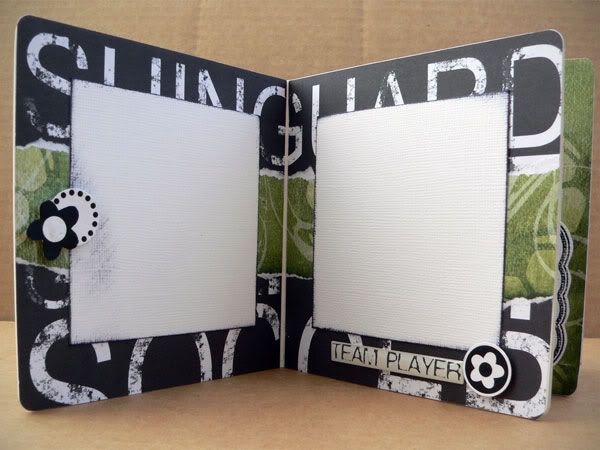 I found a mix of black and white papers, and mixed in the green soccer paper as a unifying theme throughout the book. One of the black & white papers was soccer themed, kind of edgy and grungy text. The others were girly patterns from Doodlebug's Black & White collection - full of flowers. I liked this contrast between the two - kept the book from being too "boy-like" yet not too girly either. To give some extra sparkle I used some Rangers Stickles Glitter Glue (in Black Diamond and Starburst) on some of the flowers.
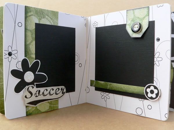 To keep things even simpler - I cut flowers out of one of the papers and backed them with cardstock for more thickness and then used foam squares to adhere them as embellishments throughout the book. For the round ones, I just used my circle punches to punch flowers out of the same paper - instant matching without any thinking!
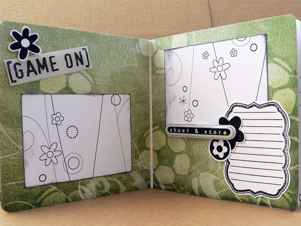 Because it was a 3 color scheme, it was really easy to just add matching journaling spots by stamping with black ink on white cardstock. I used these Fancy Shmancy Tags stamps by Sassafras Lass - they are so verastile and I find myself using them again and again - it's a different look each time you stamp in a different color on a different paper.
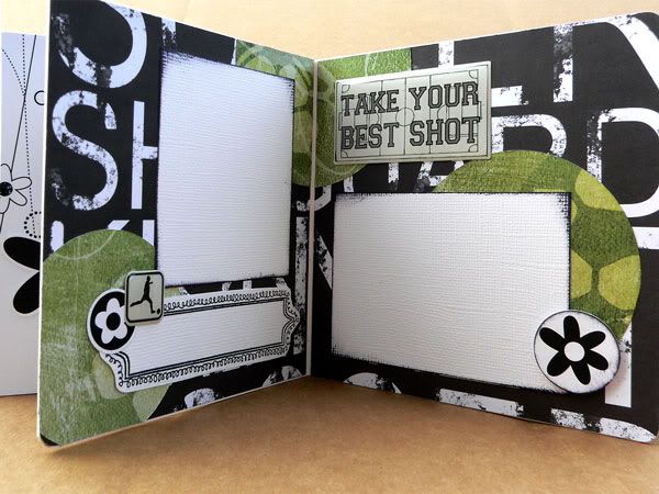 With the limited color palette it was easy to mix and cluster the embellishments, and everything looked unified. To give things a bit more pop, I inked the edges of some of the photo mats and punched circles with black ink.
On the page below, stamped one of the Sassafras Lass Tag stamps onto white cardstock and cut it out by hand as I did before, but this time instead of using it as a journaling tag, I used it as a piece to layer underneath the flower and sticker embellishments.
 Hopefully I've been able to show how black and white is a very versatile color combo - combine it with a 3rd color and you have an instant easy color scheme!
Next week's featured project will be about altering embellishments in order to either match your project or to give them an extra interesting look. Don't miss it!
Anita,
ReplyDeleteThat is a really cute album. I try to Keep It Simple also with my projects. I find that projects flow better with a simple scheme and it's also less time consuming. I offer this Keep It Simple technique as my Basic Custom Scrapbook Package. Again great work!
I love this one, Anita! I think the fact that you chose a color theme and carried it all the way through is what made it so great. Even the flowers looked totally cool on the pages.
ReplyDeleteGreat idea. I featured it on Tip Junkie today! Thanks for the inspiration.
ReplyDelete