Thursday, May 22, 2008

Reducing Clutter: Take photos of and scrapbook your memorabilia

It has been a while since the last post – I truly didn't intend for it to be so long in between! We have been busy packing, and are up to our ears in boxes. Every day goes something like “wake up, sort through some belongings, pack some boxes, label boxes, shake head at how much stuff we still have despite our best efforts to pare down our belongings.” Lather, rinse, repeat. We are moving into a much smaller space than our suburban house, so we're having to make some tough choices about what stays and what goes. Today I thought I would write about reducing clutter since it's been at the front of my mind for weeks now.

I've realized that we keep things for many reasons beyond the practical or rational. We keep things even if they are not things we use or love. We keep items out of guilt, because they cost a lot or we were convinced it was a “must have” at the time. We guiltily keep objects that we've either inherited or received as gifts from loved ones even if they're not to our tastes. For many parents, the mountain of kids artwork is another example of guilty clutter.

In addition to streamlining my own belongings, I've been trying to convince my mother to part with some old cassette tapes that are taking up space in her house.  They are classical music tapes that relatives from overseas had sent us over 20 years ago. These are not the recordings of my brother and me (concerts, recorded music lessons, random talking) - those are going to be digitized so that we will have them in a form we can actually access and listen to - I don't even have a cassette player anymore!  But these tapes in question are just commercial recordings, without any real meaning to my brother or me. My mother however, associates these tapes with a specific time in life, and is reluctant to part with them.

Luckily, scrapbooking offers us a great solution: take pictures and scrapbook these items, and purge the clutter from our lives. Many times we are just holding on to the memories associated with these items, and we don't actually love the items themselves. Scrapbooking the story behind these items allows us to let them go.

Here are some tips for scrapbooking some common things we keep out of guilt:

Kids artwork: Decide on a certain number of special pieces to keep, with your kids' input. For the remaining artwork, tape it on the wall or set it on a table in a well lit room (natural light is best) and take pictures. Have kids help you write about what the artwork is about and when they made it.  Toss the artwork soon after, or the perceived importance of the item may keep building and it will become much harder to let them go!

Inherited objects: Again, don't toss anything you love that fits your tastes, but consider parting with the objects that you keep only out of guilt or attachment to the memories imbued in them.  Photograph anything you decide to part with, and make a layout (maybe with a photo of the loved one you inherited the items from) that captures the memories that you have of your loved ones with the objects in question.  Sell these items, and treat yourself to a new thing that you love (like a new piece of artwork or that great scrapbooking tool you've been eyeing).

I am hoping to keep these ideas in mind even after the move.  I'm loving the idea of simplifying and periodically culling out unnecessary or unloved objects from my life and making space for the things that I do love, use, and enjoy.  Hopefully this will also mean less hair pulling when it's time for the next move...
Thursday, May 01, 2008

Beyond the Scrapbook Page: Dome Bling Ring from Teresa Collins

As a self labeled scrapbooking fashionista (definitely with tongue-in-cheek), I find that a lot of inspiration and creativity comes from beyond the confines of scrapbooking.  I am inspired by design, decor, crafts, nature, etc. and I like to use scrapbooking products to create things other than scrapbook pages.

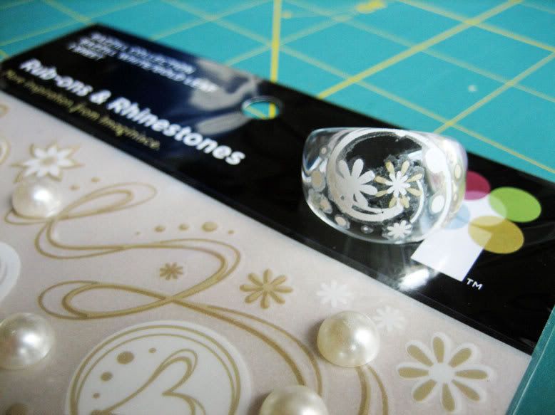
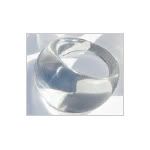
It's nice when someone else has the same thought. One of the new products to come from Teresa Collins at the last CHA trade show was these clear dome bling rings.  They are clear unadorned acrylic rings that come in sizes 7, 8, and 9. They are the perfect backdrop for adding your own creative embellishments and they make a unique style statement.


For my ring, I decided to use rub-ons to embellish the surface of the ring. Since the space to be decorated was small, I had to find some that had tiny images that would work well on the ring.  I found that the Imaginisce Rhinestones & Rub Ons sheets had coordinated designs in varying sizes, and the small sizes would work great on the dome ring - I wanted to preserve the cool effect of the clear ring and be able to see through the ring between the rub-ons - not have the entire surface covered.

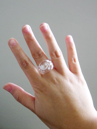
To apply the rub-ons, I first cut out the desired designs from the sheet (a larger swirl, and a variety of small flowers and dots).  I found that putting the ring on my finger made it easier to position and apply the rub on so that the designs were placed where I wanted.  Using my fingernail to rub the backing sheet gave me more control in applying the rub-ons than the popsicle stick. I started with the swirl centered on the front, and then applied the flowers and dots all around.  The swirl was definitely the most challenging as it was the largest design, being applied to a contoured surface.  I just went with the flow if there was a mess-up and used some of the flowers and dots to cover up any cracks or imperfections. And here you can see the finished ring being worn:

Well, the ring is cute, but I am painfully reminded of why I am not a hand model.... I don't have the long slender fingers with the perfect nails like one of my girlfriends...I have stubby crafter's hands (which are probably ink stained on the palms)!  All in the name of art, right?

I have successfully test washed my hands with the ring on without losing the design, but in general, I would probably be gentle with it and take it off before doing anything dirty, rough and tumble, or wet.

I love that these rings are so affordable (just $1 each), so you can play and experiment and make lots of different ones. Anything that sticks well to a slick surface should work (Staz-on or alcohol inks, patterned paper adhered to the inside of the ring with diamond glaze, etc.).  The best part is that no one will have one just like yours!

Hope you enjoyed this latest installment of the "Beyond the Scrapbooking Page!"   If any of you have created a ring, I would love to see them!

Wednesday, April 30, 2008

Moving Sale at eBay Store - Free Shipping on Orders Over $100

I don't talk too much about personal stuff on this blog, but as some of you know, my husband and I are on the verge of a big move (phase one was selling and moving out of our house last December, and moving to a temporary setup).  Phase two is moving out to California.  We have been looking forward to this for a while, and I am excited to say that our move is coming soon!

Therefore, I am throwing a big Moving Sale at my eBay Store - no point in hauling all of this on the moving truck!  I have over 100 items marked down.

Also, orders over $100 will get FREE SHIPPING!

The sale runs through May 9, 2008.  After this, the store will temporarily be closed for a few weeks as we move and get settled into our new place.  Not to worry - I will still be blogging throughout that time, and will continue to share tips and tutorials as well as feature some of my favorite fellow entrepreneurs and artists.

In fact, make sure to check in tomorrow - I will be sharing another "beyond the scrapbook page" project, and it is a fun one!

Friday, April 25, 2008

Weekly Scrapping Tutorial: Prima Paintables Layout

Watercolor-Pencils-Roxanne

I have always loved the idea of painting - artistic expression and all that.  But the truth is I'm a bit painting impaired. As in, I can't paint. Or draw. I'm afraid my drawing and painting skills are no better than they were when I was in preschool....

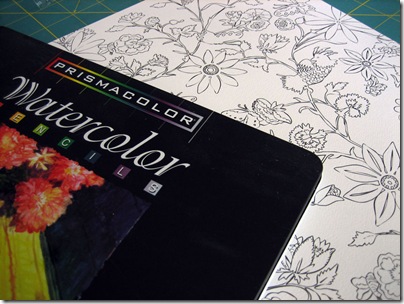
Luckily, the folks at Prima have a product that allows me to experience the satisfaction of painting without having to endure the embarrassment frustration I experience when painting freehand.  Their Paintables paper line has a variety of preprinted designs on textured watercolor paper.  You can use them plain, as a black and white patterned paper, or you can decorate them with paint, markers, glitter, etc.  Some people have told me they're a bit intimidated and unsure how to use the papers, so I decided to share my experimentation with it.

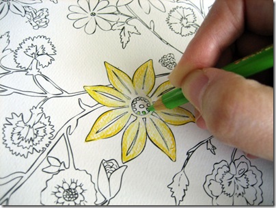
I decided to create a layout using the Roxanne paper from the line and dug out my long unused Prismacolor Watercolor Pencils.  To begin I picked out certain flowers I wanted to use and colored them in with the pencils.

Coloring-Roxanne

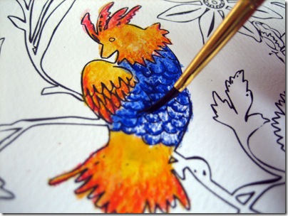
You can achieve color gradients by shading darker to lighter and you can also blend two colors (overlap part of the 1st color with the 2nd color, and blend out into the 2nd color) for more detail.  When finished coloring, I painted over the area with a small brush dipped in water.  To keep colors from muddying, rinse brush between colors.

Roxanne Painting

Note: Ultimately, I decided not to use the above bird in the layout, but included the photo to demonstrate painting with the wet brush.

I even experimented with some Glimmer Mist (a shimmery colored spray available in many hues) - after lightly "painting" the butterfly and letting it dry a bit, I cut it out and sprayed it with Glimmer Mist in Robins Egg a few times until I reached the color I wanted.

Glimmer-Mist-Butterfly

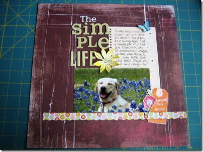
After cutting out the images I wanted from the paper, I used them as embellishments on my layout - I find that to be a great way to use papers that might be too busy or difficult to use as a whole sheet.  Also, if you mess something up, you don't ruin the whole layout!

Simple-Life-Layout

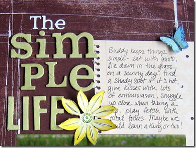
A closeup shot:

Simple-Life-Closeup1

I was having such a good time painting, I also used Tim Holtz Distress Crackle Paint on the chipboard letters in the title.  I love that it comes with a brush inside the lid and it is an easy one step process, unlike traditional crackle mediums.

I found myself happily painting all morning - I will never be a fabulous painter, but with Prima's Paintables I can still enjoy myself and color & paint to my heart's content! 

You can find Paintables, Glimmer Mist, and Ranger Distress Crackle Paint in my eBay store.

Also, Prima's blog has a great Paintables Tips and Techniques entry that gives tips on even more ways of decorating Paintables.

Happy painting everyone!

Friday, April 11, 2008

Beyond the Scrapbook Page: Upcycled Magnetic Monograms

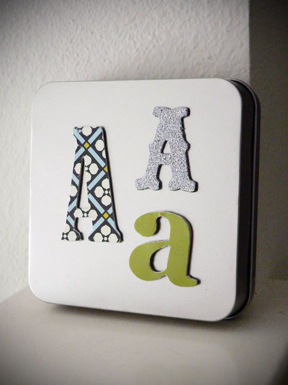
Lately I've been taken with the idea of inspiration boards, and the use of typography in home decor.  One afternoon while cleaning some scraps off my crafting table, I realized I had just what I needed amongst my bits of stuff to create some magnetic monograms for that magnetic inspiration board I keep saying I'm going to make.  

I have this habit of saving things I think I can make something out of later...little leftover scraps from my favorite scrapbook papers, bits of ribbon, paperboard jewelry boxes, and even the fridge magnets that realtors and pizza joints send!

For this project, I used the following supplies:

  • Promotional magnet with last year's calendar printed on it (any flat magnetic sheet will work)
  • 3 of the larger chipboard letters from my scrapbooking stash, and
  • Some bits of scrap paper.
  • Sanding block
  • Basic Grey Precision File Set
  • Adhesive
  • Craft knife or scissors

The basic process for making the letters is as follows:

  1. Sand the printed surface of the magnetic sheet to rough it up for better adhesion.
  2. Trace the letter (face up) onto the face of the magnetic sheet
  3. Cut the letter out from the magnetic sheet using a craft knife.  Cut inside the lines for best results.
  4. Apply adhesive to the back side of the letters. I used my ATG, making sure to go all the way to the edges, but a Xyron machine would work as well. I would not recommend a liquid glue, as it would probably slide around too much.
  5. Apply the face of the magnetic cut-out to the back of the letter.
  6. For the letters to be covered in patterned paper, turn the letters face down and trace onto the back of the paper.  Cut the traced letters out and adhere to the front of the chipboard letters.
  7. After adhering the paper, sand the excess off.  Basic Grey's Precision File Set is great because it has lots of small files to get in those little nooks and corners.
  8. The glittered A in the top right of the photo is actually from a Junkitz Chipboard Alpha set.  All I had to do for that one was to take the letter and adhere to the magnetic sheet (as described in steps 1-5).

And that's about all there is to it!  You could do tons of variations using different chipboard or grungeboard shapes, or even use a die cutting machine like a Sizzix to cut out both the magnets and the chipboard for your own custom shapes.  Hopefully I've sparked some ideas for your own home decor projects!

Tuesday, April 01, 2008

April Fool's Sale - One Day Only!

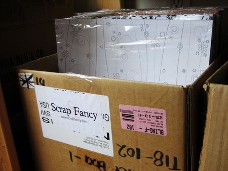
As I mentioned yesterday, I am having a big one day sale at my eBay store Scrap Fancy Boutique to celebrate April Fool's!

Find tons of items marked 40% off for one day only! On top of that, all you lucky blog readers are in for a treat - if you place an order, request a total through eBay, and type "GIFT401" and you'll get a free goodie with your purchase (good for purchases made April 1 only).

Don't miss this great opportunity to stock up on some great embellishments, clear stamps, and more - visit my store!

Monday, March 31, 2008

New at Scrap Fancy Boutique

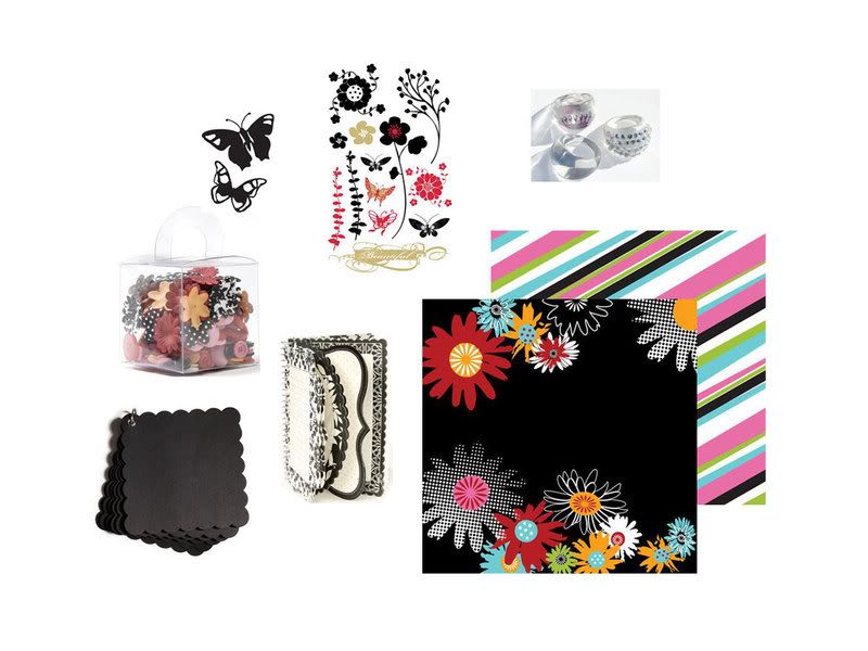
It's an exciting time at my eBay Store, Scrap Fancy Boutique!  Lots of new products are arriving, so I thought I'd share a few of my recent favorites (click image to see larger).

Clockwise, from bottom left:

  1.  Cosmo Cricket Blackboard - Kate's Album - This is brand-new from Cosmo Cricket - chipboard with a fresh twist. This chipboard is black to the core. Tons of embellishing possibilities with this product!  Rub-ons, white pen, paint, and bling come to mind. This scalloped mini album is one of my favorites.  I also stock blackboard alphas and shapes!
  2. Making Memories 5th Avenue Collection - Elizabeth Blossoms & Buttons -  an adorable collection of buttons and felt and paper flowers that coordinate with the 5th Avenue Collection. I love that some of the flowers are solids, and some are prints! I also carry the coordinating papers which are super stylish.
  3. Heidi Swapp Butterflies Mini Mask - this isn't a brand-new product, but the butterflies are so perfect for spring layouts. I know some of you are still seeing snow, so this is a great way to bring a little Spring to your day!  Love that this product is versatile, reusable, and affordable! Don't miss the other shapes I have too!
  4. Cherry Arte Rub Ons - Her Basics - a new design from Cherry Arte (coordinates with His & Hers Basics).  Love the different flowers and butterfly designs.  I have coordinating papers in stock as well.
  5. Teresa Collins Clear Bling Ring (Dome Ring) - these rings are so glam! They are clear dome rings, and you can make your very own design by embellishing with patterned paper (adhere with diamond glaze or glossy accents), rhinestone bling, rub-ons, alcohol inks, and more! They come in 3 sizes (7, 8, and 9).  At only a buck each, you can make yourself one for every day of the week!
  6. Cherry Arte 12x12 Scrapbook Paper - Girl Power - this vibrant design is signature Cherry Arte. The double-sided design makes it easy to coordinate your layout. See more Cherry Arte papers in my store.
  7. Making Memories 5th Avenue Collection - 4x6 Spiral Journaling Book - I had this in my store earlier and it sold out quickly. Now I have it back in stock! These spiral books are really fun and versatile. Just tear out a page, stick it to your layout clustered with some embellishments, and journal away! Tons of creative uses for this product. Don't miss out on them this time around!

So, if you haven't checked out the Scrap Fancy Boutique in a while, come and browse around a bit. You never know what new goodies you might discover!

P.S. - Be sure to check in tomorrow.  I will be having a great APRIL FOOL'S ONE DAY ONLY sale (no fooling!), and blog readers will get a special code word to score some free loot with any purchase from the ebay store. Don't miss it!!

Wednesday, March 26, 2008

Weekly Scrapping Tips: Customizing your own embellishments

Today I wanted to share some ideas for customizing and creating your own scrapbooking embellishments.  Sometimes as you sit down to create, you may realize you have something that's the right style and shape but the wrong color. Or maybe, you want to add some flair and tie the embellishment in to the style of your project.  There are some fast and easy ways to do this!

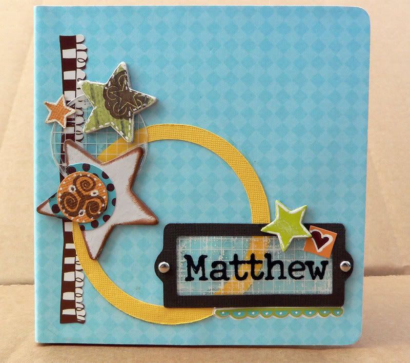
Here is a board book I created for a client (yes, I DO make things other than board books LOL).  This book incorporated a lot of KI Memories' Love, Elsie stickers, so it had a really playful look.

I loved the idea of having a smattering of stars on the cover, so I used some of these American Crafts Playhouse Chipboard Stars, along with a star shaped punch (for the small orange star on the top left).  The stars were the perfect assortment of shapes and sizes, but the colors didn't all match the Love, Elsie color scheme , and they lacked the playful detailing that I was looking for.

Dressing them up proved to be really easy and fun. For the topmost star (originally pink colored), I simply swiped the star with a layer of Tombow Mono Multi Glue, then adhered a small scrap of green paper to it. I then trimmed the paper as close to the edge of the star as possible, and used some sandpaper to sand off the excess. This gave it a cool distressed look as well. Then I stamped a star onto it with brown ink (purposely letting the design run off the edge), and to finish it off I used my trusty White Signo Pen to add some faux stitching around the edges. The little orange punched star and the little green chipboard star also got the white pen treatment around the edges, and I also highlighted the heart sticker and the scalloped sticker with the same pen to give it more pop.  Yes, I really do use that pen on almost everything!

The big white chipboard star was fun to alter as well. I started with using one of my Colorbox Cats Eye Ink Pads to ink the edges. Their unique shape and small size makes it easy to really get all the sides on small embellishments like this. Next I adhered a round blue/brown Love, Elsie sticker on the star and trimmed off the excess. The orange circle on top is one that I punched out of cardstock and embellished by first stamping a design in brown ink, then adding white detailing in using the Signo Pen.

So hopefully you enjoyed this installment of weekly scrapping tips, and you have some new ideas on how to make premade embellishments work for you if they're slightly different from what you need! It definitely took longer for me to write out the steps and post this than it did to actually customize the embellishments!

Thursday, March 06, 2008

Weekly Scrapping Tips: Keeping it Simple

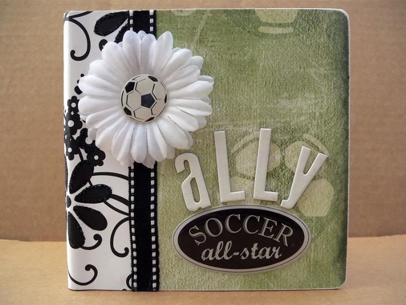
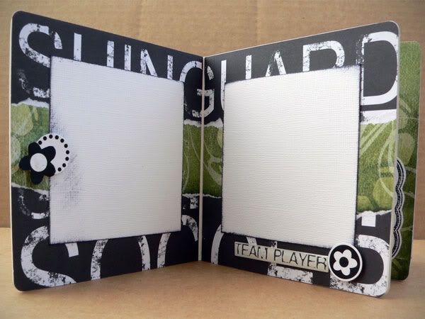
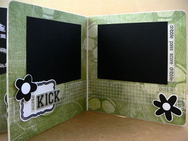
Ok after a slight pause we are back with the weekly scrapping tips. Last week's weekly tips post was postponed to this week because I didn't want to show it here before my client had a chance to show it to her recipient. I am excited how this album came out - I didn't have a lot of time to put it together, and I wasn't sure where I was going with it at first, but the key to pulling this one out successfully was to KEEP IT SIMPLE.

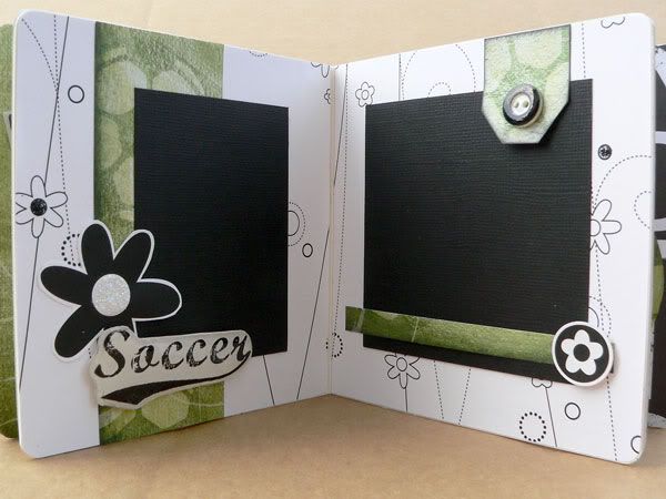
This album was for a little girl who adores playing soccer. I chose the soccer themed items first - some green soccer paper and some epoxy stickers for some dimension. At first I was worried that the two things were too masculine, and I wanted this book to be a bit girly and fun (but not too frilly since it is about soccer, after all). So originally i went in a direction with more colors - pinks and bright greens and yellow. When I laid out all the papers, I felt like there were too many colors - especially if later the photos had even more colors, with all the uniforms, etc. So, I limited the color palette to just green, black, and white and found that it all came together much more easily this way.


I found a mix of black and white papers, and mixed in the green soccer paper as a unifying theme throughout the book. One of the black & white papers was soccer themed, kind of edgy and grungy text. The others were girly patterns from Doodlebug's Black & White collection - full of flowers. I liked this contrast between the two - kept the book from being too "boy-like" yet not too girly either. To give some extra sparkle I used some Rangers Stickles Glitter Glue (in Black Diamond and Starburst) on some of the flowers.

To keep things even simpler - I cut flowers out of one of the papers and backed them with cardstock for more thickness and then used foam squares to adhere them as embellishments throughout the book. For the round ones, I just used my circle punches to punch flowers out of the same paper - instant matching without any thinking!

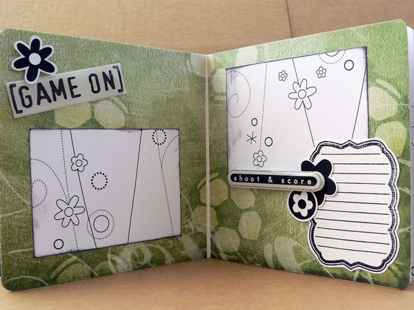
Because it was a 3 color scheme, it was really easy to just add matching journaling spots by stamping with black ink on white cardstock. I used these Fancy Shmancy Tags stamps by Sassafras Lass - they are so verastile and I find myself using them again and again - it's a different look each time you stamp in a different color on a different paper.
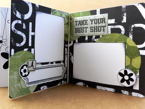
With the limited color palette it was easy to mix and cluster the embellishments, and everything looked unified. To give things a bit more pop, I inked the edges of some of the photo mats and punched circles with black ink.

On the page below, stamped one of the Sassafras Lass Tag stamps onto white cardstock and cut it out by hand as I did before, but this time instead of using it as a journaling tag, I used it as a piece to layer underneath the flower and sticker embellishments.

Hopefully I've been able to show how black and white is a very versatile color combo - combine it with a 3rd color and you have an instant easy color scheme!

Next week's featured project will be about altering embellishments in order to either match your project or to give them an extra interesting look. Don't miss it!

Thursday, February 21, 2008

Weekly Scrapping Tips: Buttons Buttons!

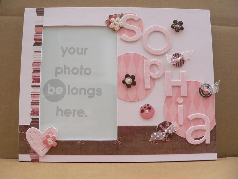
One of the services I offer at Scrap Fancy is custom scrapbooking, meaning customers commission me to make a scrapbook or an altered project for them. This is one of the projects I just completed, an altered frame for a baby shower gift.


I started with a frame from Creative Imaginations' Bare Elements line, and went with a pink and brown color scheme (one of my favorites - pink and brown are Scrap Fancy's colors).

I started with the pink cardstock base layer, and then added the vertical striped strip and the horizontal brown strip. Then I added 3 pink circles (things look better in odd numbers groupings) to the frame. I let the circles run off the edges of the frame, just trimming the excess that hung over - I find that things just look more pleasing to the eye when you let them overlap or break out of the box. I liked that it was all different shades of pink, so it was subtle, but added some interest and depth to the background. To keep things looking harmonious, I kept all the circles' argyle patterns running in the same direction.

Since the frame was for a baby girl I wanted something sparkly and fun, so I used these Doodlebug chipboard alphas to personalize the frame with baby's name - the letters are pre-glittered and look like they're coated in sugar! The cute heart in the bottom left corner also comes from that set.

To add more dimension, I scattered buttons around the name, and layered on top of the heart. These pretty buttons by Making Memories are actually made of chipboard with an epoxy coating to make them glossy. These buttons are great because they are lightweight and have pretty coordinated patterns, making it really easy to spruce up a page or project. However, I am one of those people who likes her buttons threaded - though I don't always do it, it bugs me when I leave the button holes naked! So in this case I used embroidery thread and sheer ribbon to thread the button holes. This created a challenge when sticking the buttons to the frame. Normally I'd use glue dots for the job, but the thread and ribbon can cause a really lumpy backside, making it hard for the glue dot to securely stick to both the button and the frame. The answer - Pop Up Glue Dots! They are really thick, so they just mold to the lumpy backsides of the buttons, and stick securely to the frame, and add nice dimension by raising the buttons off the frame a bit! Using the right adhesive for the right job makes all the difference in the world. I think I must use over 8 different adhesives in my scrapbooking, ranging from liquid glues to acid-free, double-sided tape, depending on my needs!

Well that about does it for this project. Thanks for tuning in for my tips - hope they help! Happy scrapping!

Wednesday, February 20, 2008

What Color are You?

Take this test!
You're blue — the most soothing shade of the spectrum. The color of a clear summer sky or a deep, reflective ocean, blue has traditionally symbolized trust, solitude, and loyalty. Most likely a thoughtful person who values spending some time on your own, you'd rather connect deeply with a few people than have a bunch of slight acquaintances. Luckily, making close friends isn't that hard, since people are naturally attracted to you — they're soothed by your calming presence. Cool and collected, you rarely overreact. Instead, you think things through before coming to a decision. That level-headed, thoughtful approach to life is patently blue — and patently you!

Wednesday, February 13, 2008

Weekly Scrapping Tutorial & Tips: *Gasp* The Fashionista makes a themed album...

I know, I know! I've been MIA so long you probably think I disappeared for good. Well, as it so happens, DH and I sold the house and moved since the last post, so after settling in and getting my ebay store back up and running, I have returned to blogland.

To make amends, I thought I would start a new weekly blog feature: scrapping tutorial and tips (p.s. - I reserve the right to rename it when I come up with something more imaginative)!

Once a week I will post a project and share hints and tips with you. The idea is not to give you a step-by-step recreation of the specific project, but rather to share techniques or tips, and a bit of my creative process so that you can use them in lots of different projects.

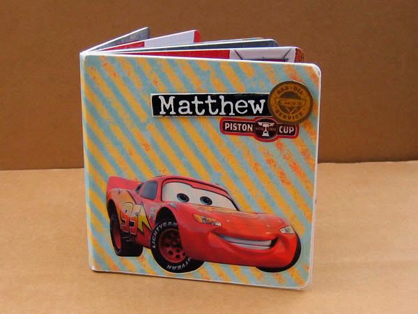
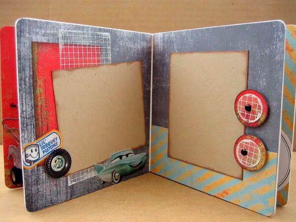
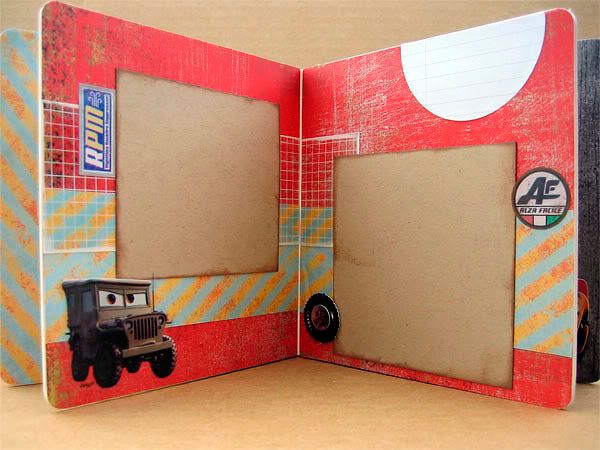
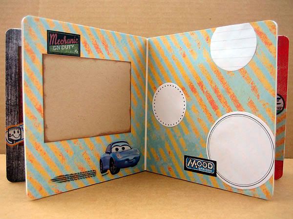
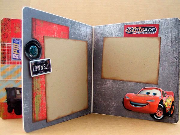
This week's project is a board book I made for a little boy who loves the movie "Cars." This was actually somewhat of a stretch for me, because I'm not a big themed-product scrapbooker. I have been dubbed a scrapping fashionista for my love of the latest sophisticated embellishments and artistic papers, so I really enjoyed the challenge here of incorporating the theme while not letting it override all sense of design and creativity!

First I chose the products I wanted to use, starting with the themed stickers. Using the colors and style of these stickers, I chose some papers - red and gray distressed paper to coordinate with Lightning McQueen. This striped paper brightened things up and gave a sense of movement. I used distressed papers because much of the movie was set in Radiator Springs, which was run down and dusty.

I put Lightning McQueen on the bottom of the cover, to give it some visual weight there, and I clustered the boy's name with some stickers in the top corner of the cover, so that those elements would not just be scattered randomly. Note that Lightning McQueen is facing toward the opening of the book - I find this helps direct your eye toward opening the book. The direction of the striped paper also reinforces this.

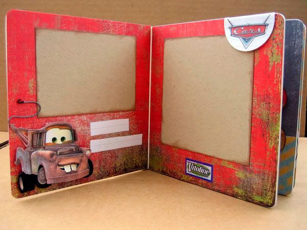
I continued the distressed look by inking the edges of the kraft photo mats. Using the same color scheme throughout the book, and using some of the same papers from page to page keeps everything feeling cohesive and coordinated in a mini album.

Creating a visual triangle helps the pages feel unified, and tells the eyes where to go. In the above photo, notice the red paper and the grid transparency on the left side are repeated in the two circles on the right page.

I couldn't find Cars themed scrapbook paper when I was shopping, which turned out to be a blessing. I think themed stickers AND themed paper could have been overwhelming here. The papers I used actually have nothing to do with cars or the movie at all. The stripe is from My Minds Eye, and the red and grey papers are from Basic Grey's Scarlet's Letter collection. The grid transparency is a Hambly overlay. You wouldn't think to use them on a scrapbook with a Disney animated movie theme, but they work! Keep an open mind when shopping for paper and embellishments - try seeing beyond the theme or the collection the papers come from when searching for the perfect match for your project.

I kept all the cars in the book on the bottom, so the pages would feel grounded. Floating cars all over would just say "sticker sneeze" and feel too overtly themed, I think.


Well that's it for my first scrapping tutorial feature! Hope you found it useful and interesting. If you have any questions or feedback, I'd love to hear it!